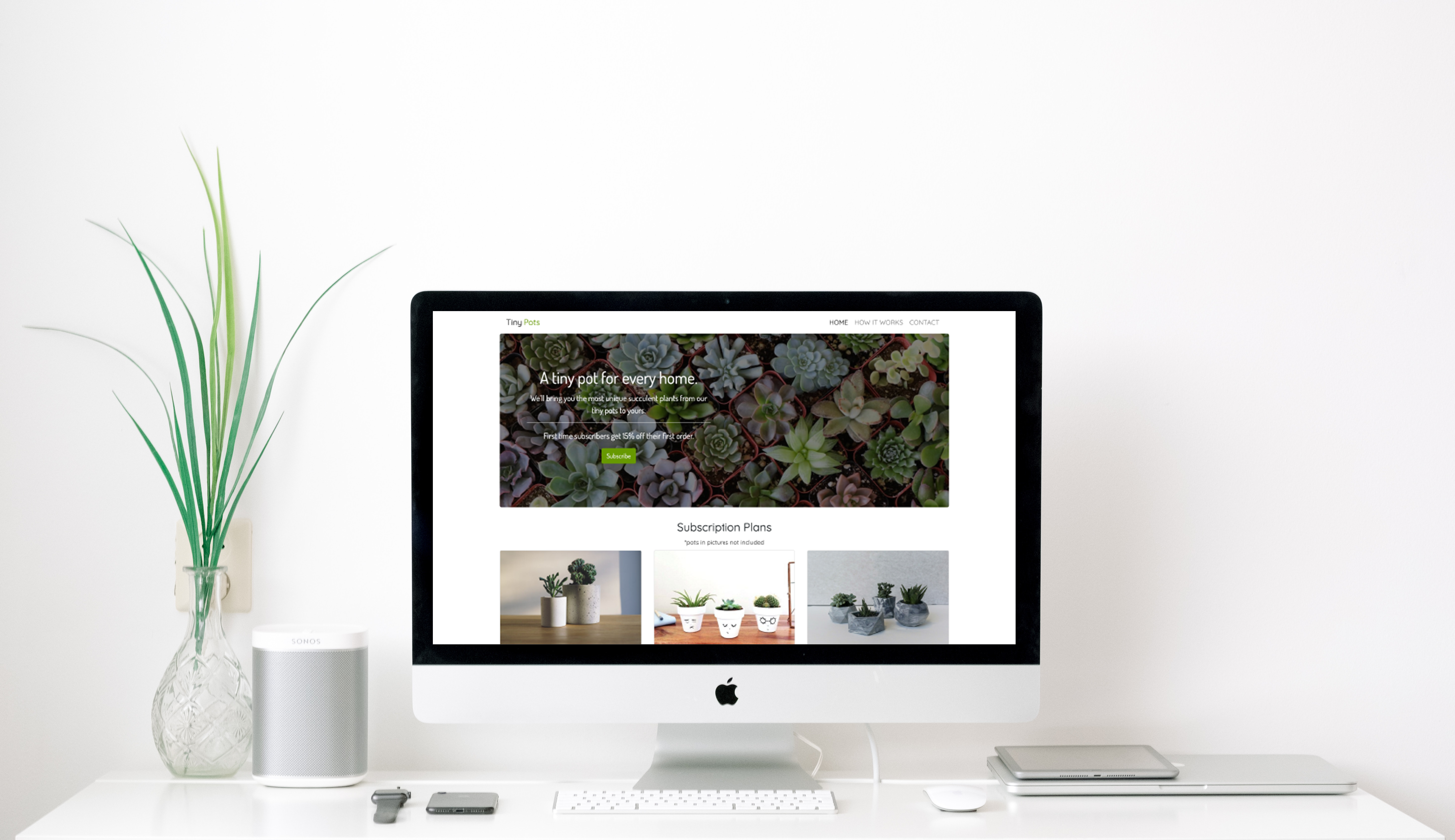
TinyPot’s goal is for others to have the same feeling the owner felt when propagating succulents as a college student in her dorm. She wanted to create that feeling by opening up a subscription box every month. She created this subscription company so others can learn more about unique succulents and have a new surprise every time.
By having two primary colors colors, it allowed to give the site a simple look without taking away from the personality of the brand. While adding only two accent colors to use when needed. When choosing the font, rounded fonts like quicksand and dosis helped create a warm and friendly feeling the client was looking for.

When working on the website, I felt that it needed a personal touch. I created these graphics of succulents on Adobe Illustrator to complement the natural, calming vibe of the site. By incorporating these custom illustrations, I aimed to add a unique and warm element that would resonate with the audience and make the overall design feel more inviting and tailored to their experience.

Then after careful consideration to the market, TinyPot came to life using HTML, CSS, JavaScript, and JQuery.
View Site