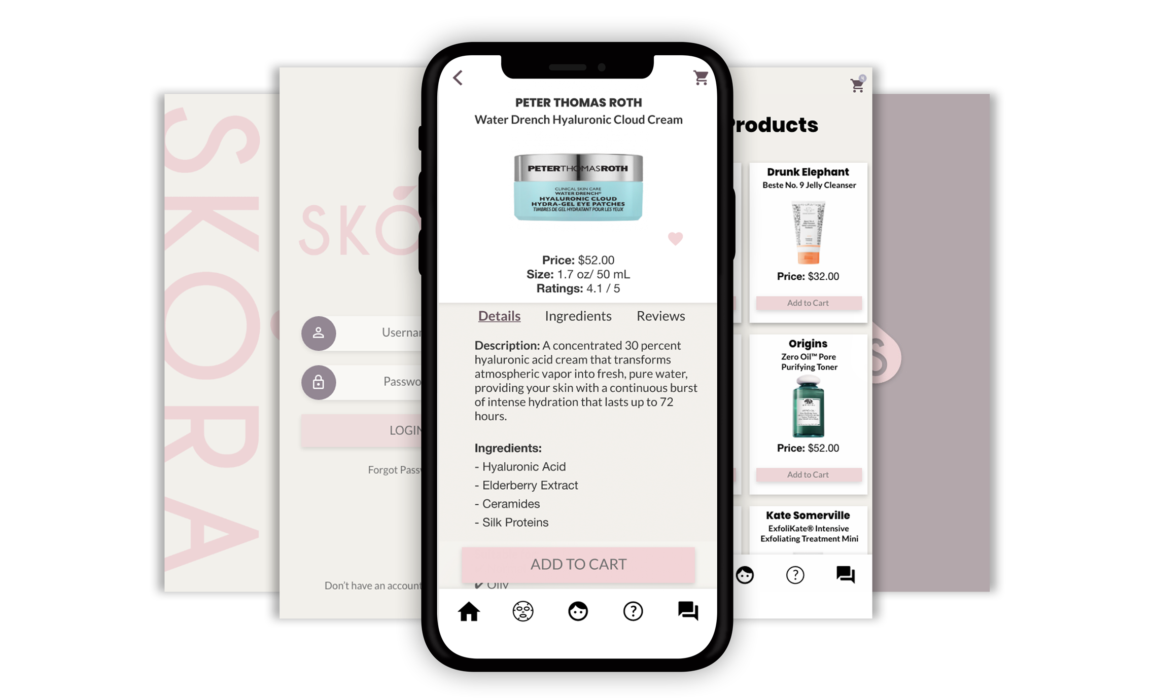
Skora is a service that features skincare products and their point-of-sale locations based on the user’s profile of skin conditions and compatibility. It uses a quiz to help target the user’s needs. Once the user completes the quiz, the app uses skincare specialists to help select products.
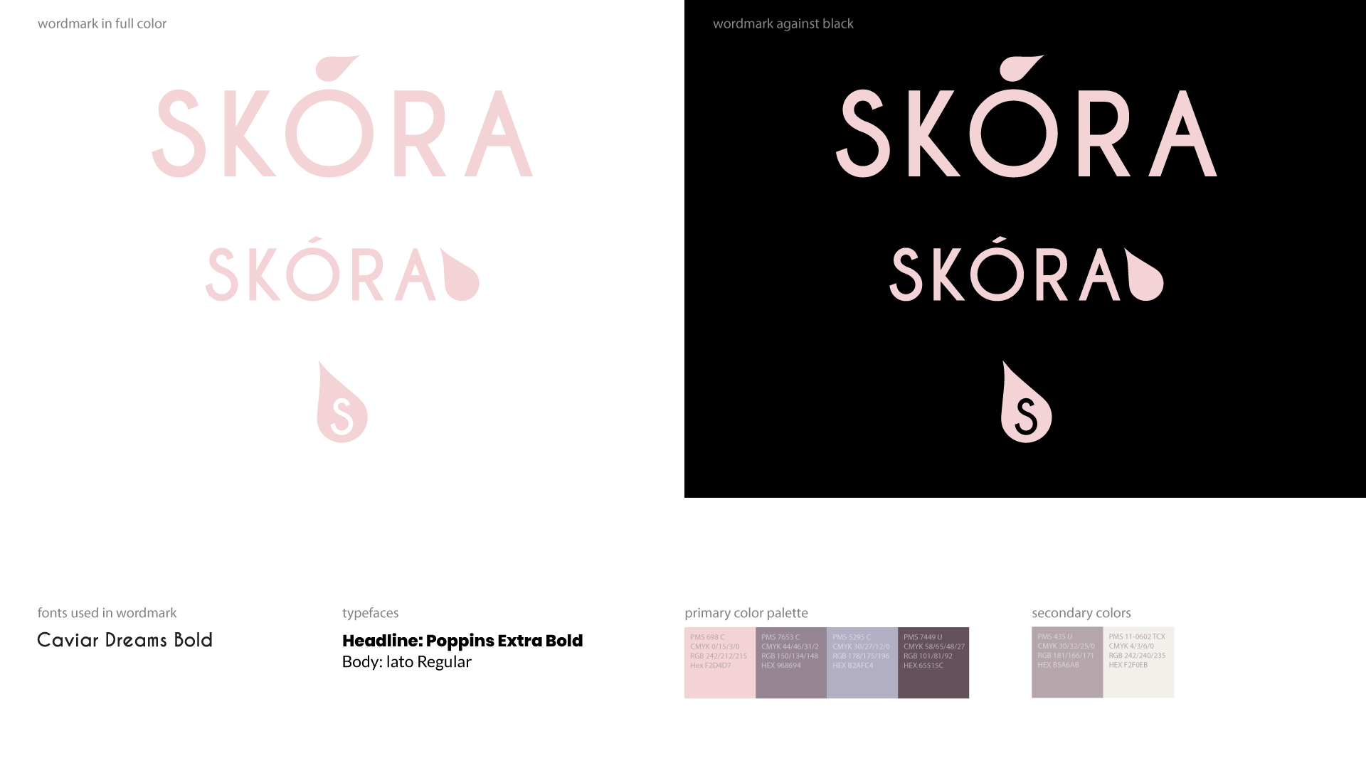
When creating the design, I was given a branding guide designed by Aram Alotaibi for Skora. My client provided me with the content that they wanted to appear on their site along with a few of their ideas that they visioned for their app. This gave me some ideas about how I wanted to design.
After making sure I got all the information I needed, I began to design an app that made sure to incorporate the information in a simple way.

Meeting One
The first meeting is always nervous and exciting all at the same time.
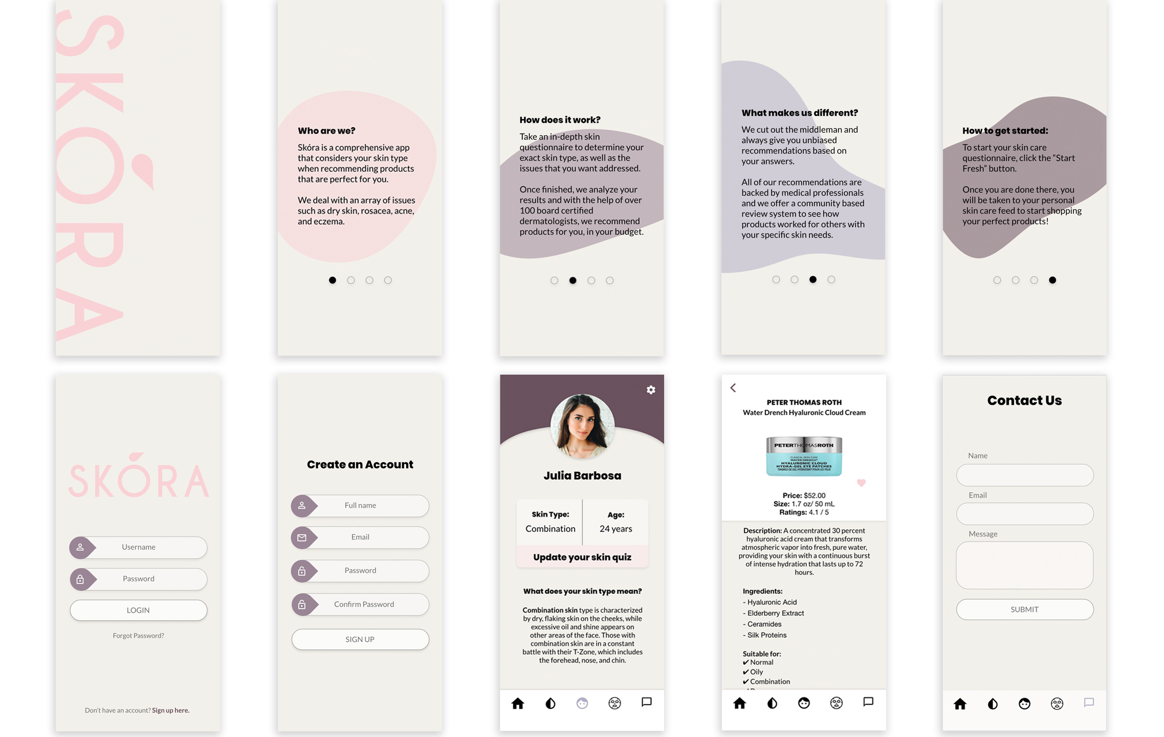
First impression, they loved the design I came up with. It was the overall feel they wanted for their brand. Though, like all first meetings, there's always something to help make it better. They wanted some of the colors in the introduction to flow better with the other colors. Check.
They loved the text inputs I provided for them, but wanted to see different input shapes. Check.
To them, the product page was missing something, but they weren’t sure what. More color? They wanted a way to feel more cohesive with the app. Check.

Meeting two
I had incorporated the feedback they had given me. Which also changed a few things around in other parts of the app as the vision continued to grow.
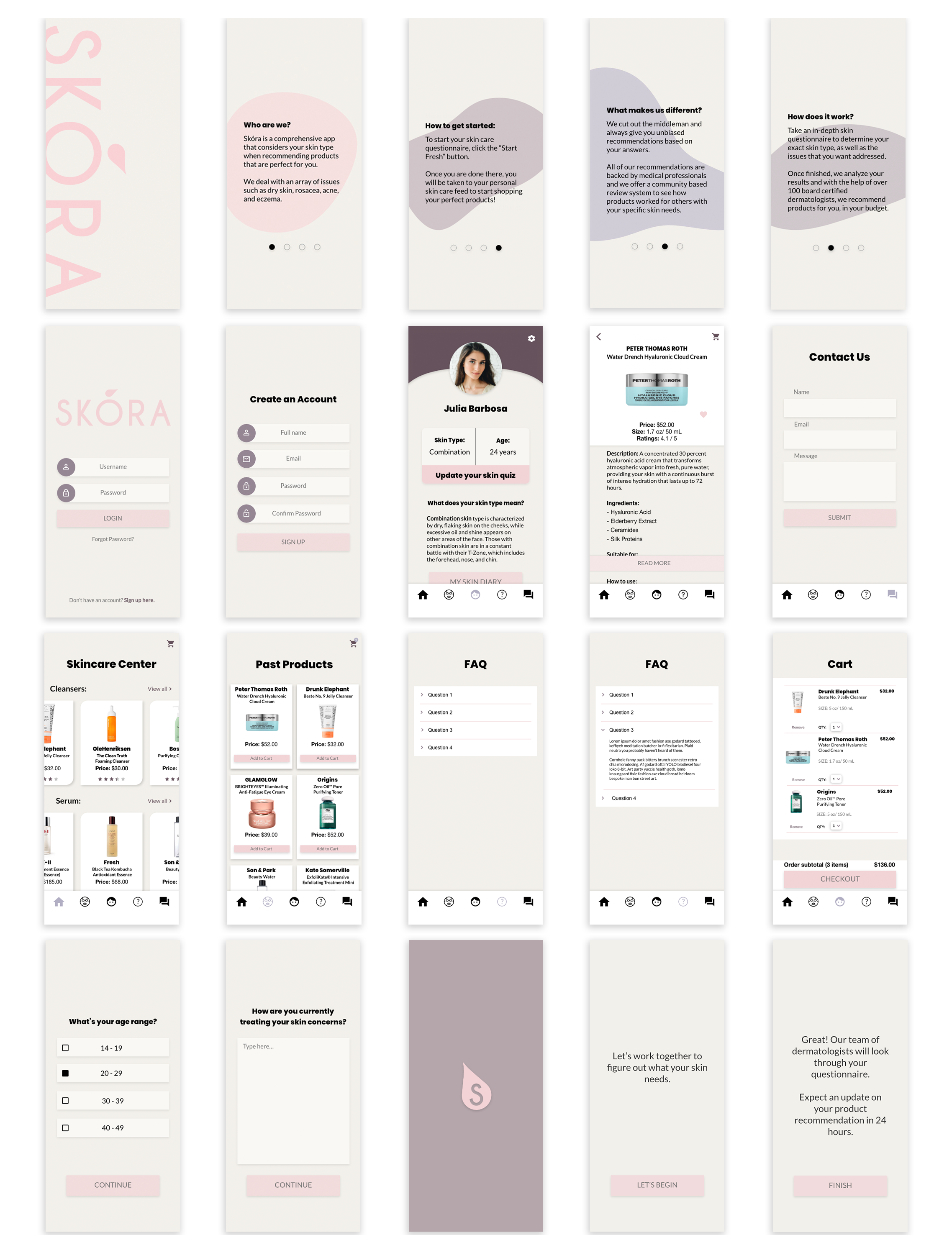
At the last meeting, they mentioned how they wanted an FAQ page, but they didn't have the information to put it in yet. I created a visual of what their FAQ page might look like until I'm given the content. After seeing the changes, they requested, we decided to go more in that direction since it had a better feel with the overall brand.
I created a few things that they never mentioned they wanted in the design: a loading screen, an introduction, and an ending prompt for their quiz. They got excited to see the simple elements that could personalize their brand. There was also something about the product page that needed improvement, so I figured I’d find a way to alter it to make it fit better with the design.

Final Meeting
The final meeting with the client was mainly to touch base to clean up any last minute designs. Slight alterations were made before the design was complete.
This was the best part, seeing the designs that we’ve been working on together come to life.
View Prototype