Clusterizr's mission is to strengthen the connection of UCF students & alumni with local companies within the tech industry. On a team of marketing specialists, UX engineers, content SEOs, designers, and developers, Clusterizr came to life with a "by students, for students" motto. While working in the marketing and branding team, I produced different strategies to brand and promote Clusterizr.
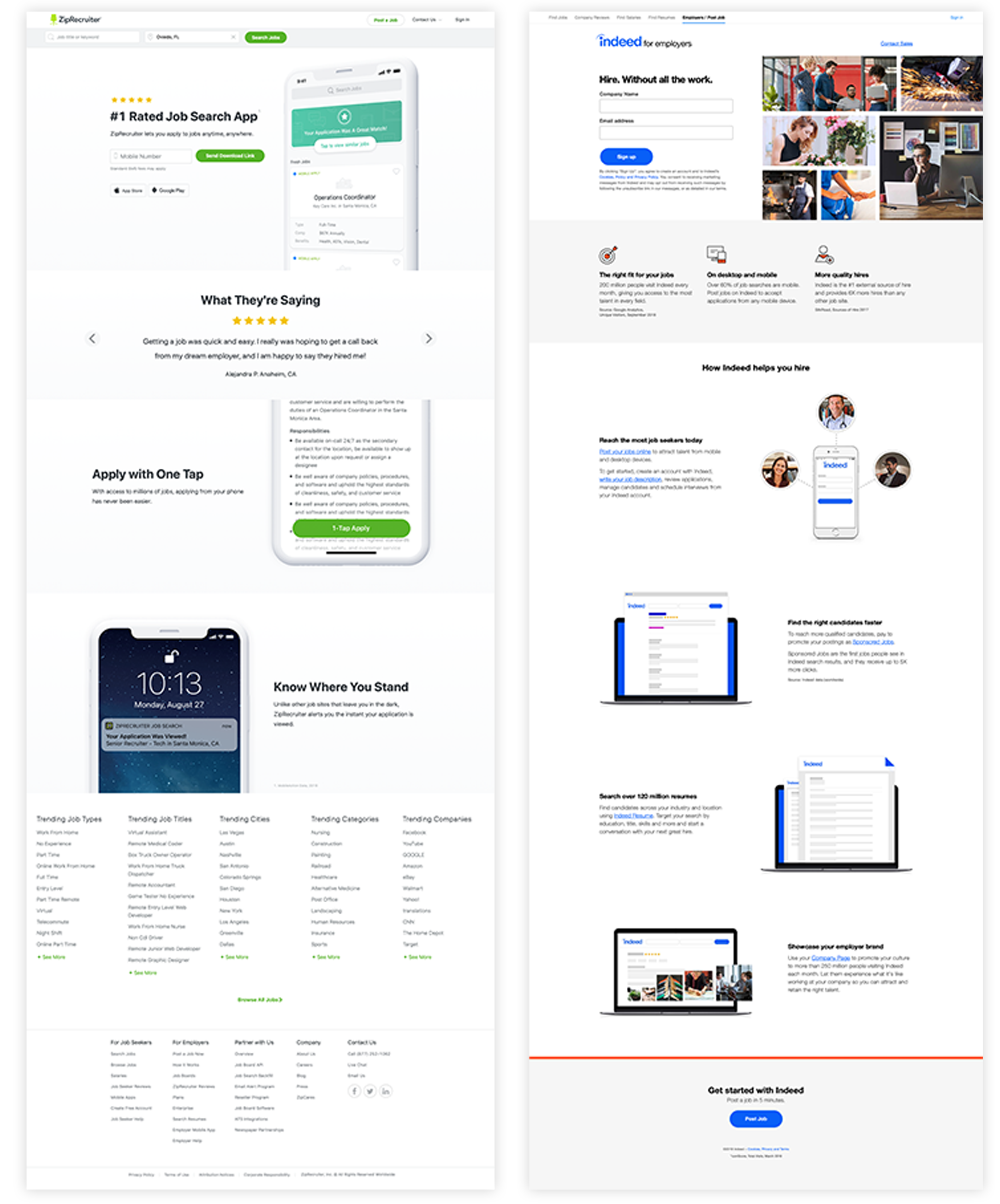
The team spent a week and a half conducting market research on sites like Indeed, ZipRecruiter, LinkedIn, and Handshake, which were great comparisons for the Clusterizr. Our goal was to create a site where UCF students feel like Clusterizr is a place that could fulfill all their needs and feel the sense of community that UCF provides. We looked into other websites like Jobcase, MyOpportunity, Glassdoor, and Snagajob, as well, to get a broader look into what other competitors were doing.

Screen shots of Indeed and ZipRecruiter.
Market features that made the researched sites successful.
Market features that interfered with the user experience.
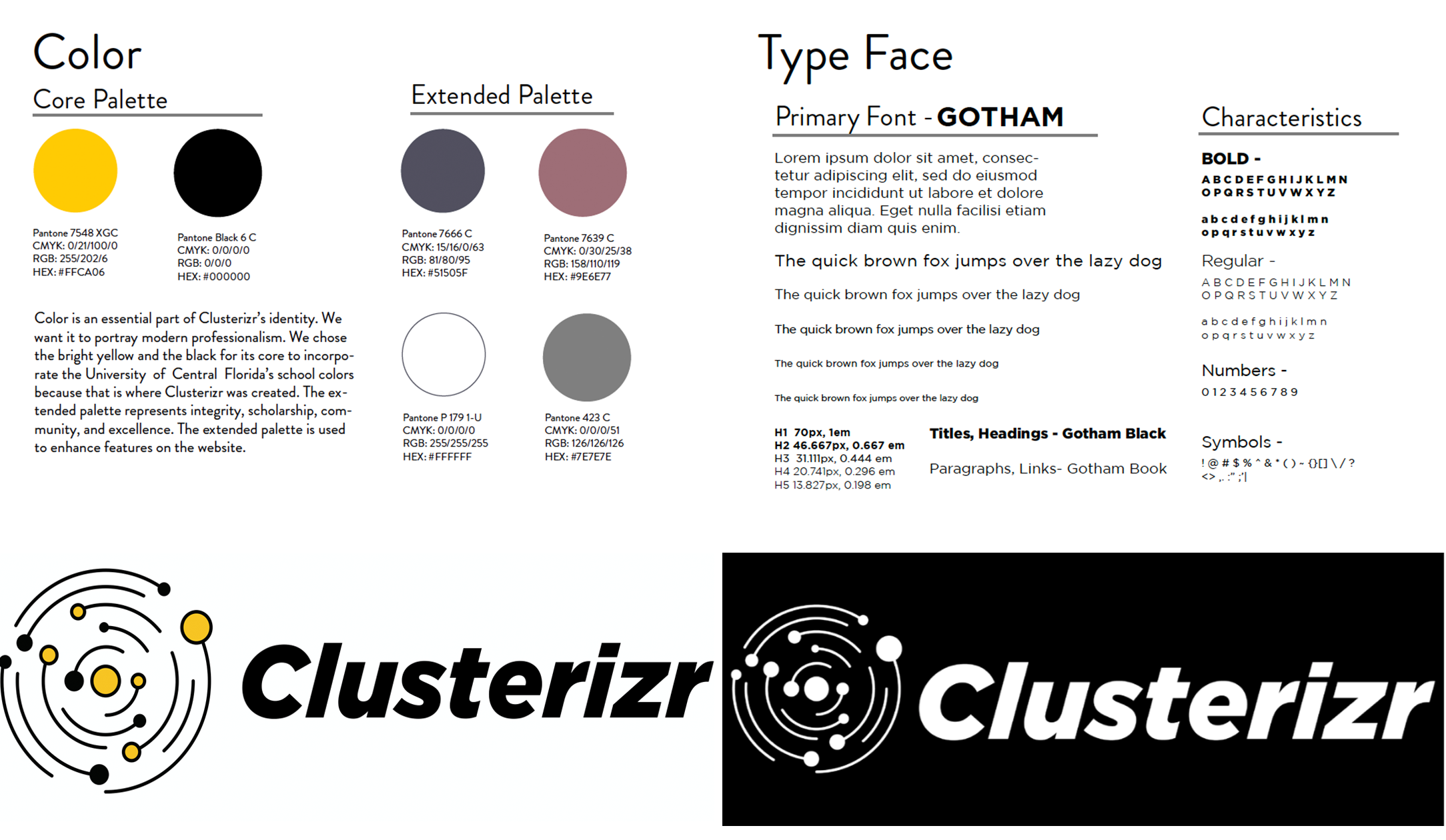
Using the University of Central Florida’s style guide to go along with Clusterizr branding allowed students to feel connected to UCF. It was beneficial to apply the connection between UCF and local companies.

In a marketing team, that means there's a lot of ideas. I decided to focus on creating two strong campaigns that would Clusterizr to reach UCF students.
Turn the Tables video campaign.
It’s a video that shows the struggle of a college student trying to get a job/internship, but they are constantly told no at the interview. When they discover the website and get matched, they end up getting a job.
The video focuses on going in a circular rotation around someone being the main focus.
It starts behind the person as you see them researching in their room. Things change, like lighting, clock, to show time is passing. It slowly rotates in front of them as you see them in an interview, backgrounds different, outfit change, etc. You see their smile slowly turn to a frown after every interview, as they get rejected. Then it rotates slowly behind them again as they run into one of our flyer/ads and, it keeps rotating until it’s back in front of her as she is shaking hands with an employer smiling. (showing she got the job)
Share Your Match – Engagement
We want students who get matched with companies to take a picture or screenshot to post it on their social media.
This'll include #shareyourmatch, tagging @clusterizr, and anything else we find relevant during the campaign.
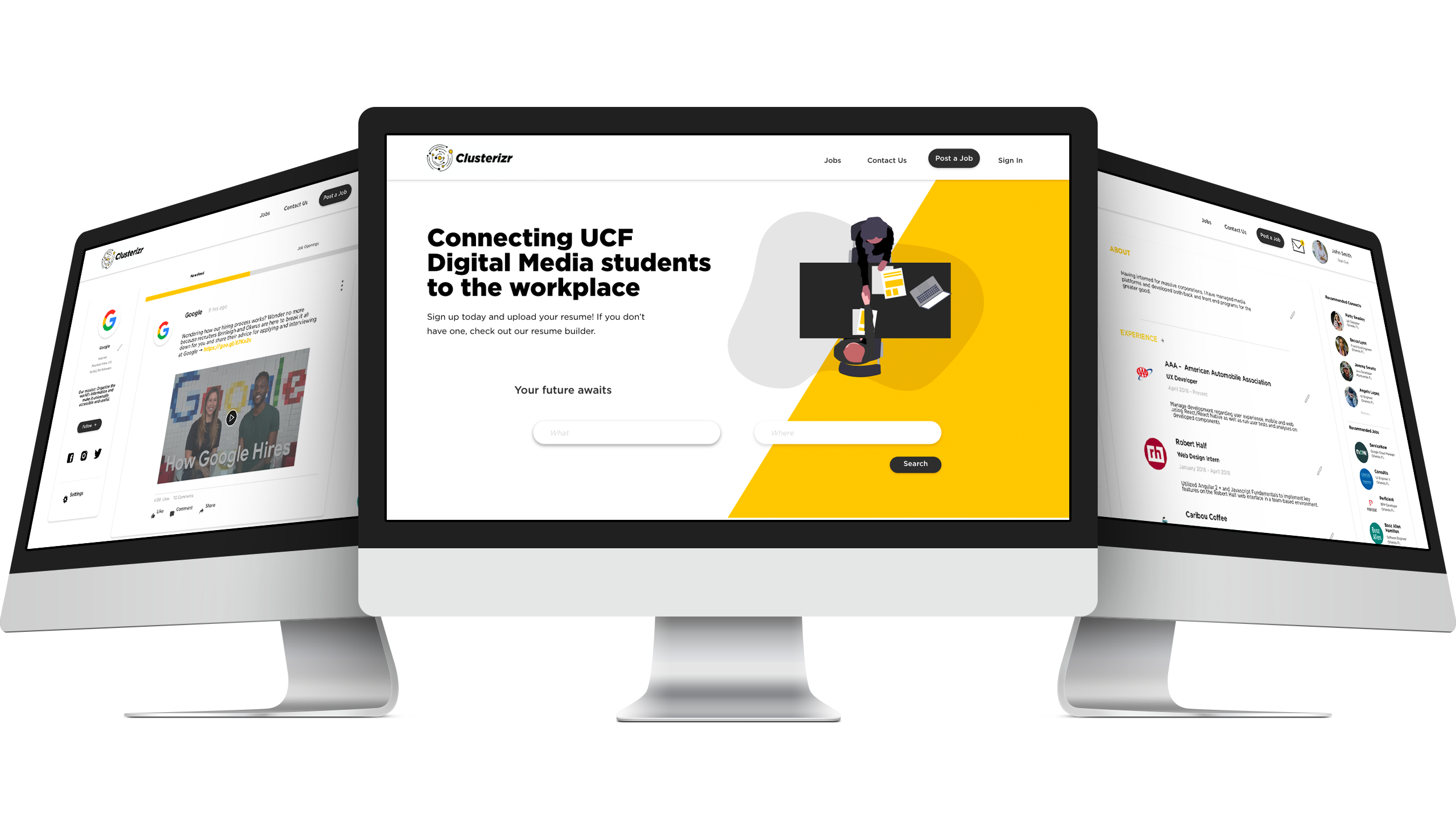
Our hi-fidelity designs are made up of 46 screens to capture the site's capabilities. By combining our UX/UI research and implementing the branding guide, we were able to design a prototype that's easily market towards tech-students. While also implementing some social media marketing campaigns to bring in the students.
View Prototype