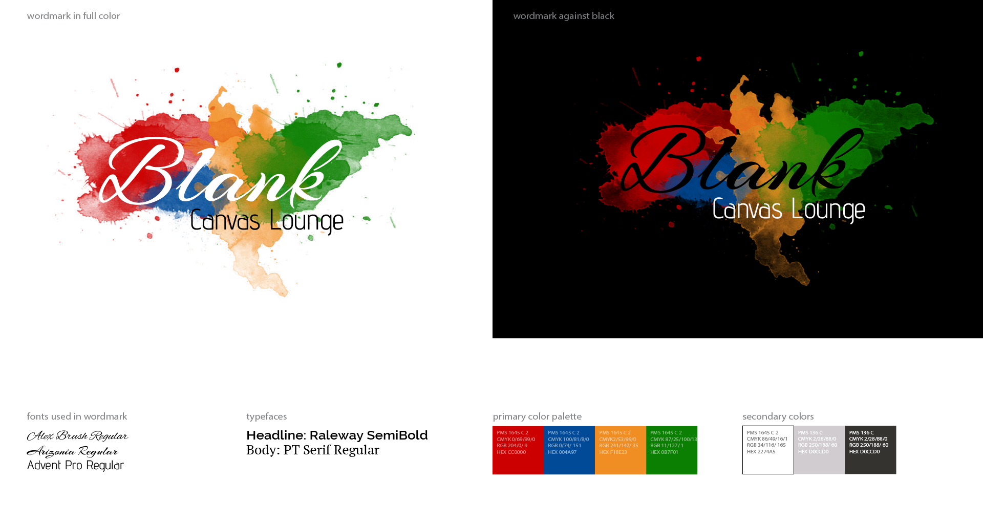
It's a lounge that serves beer, wine, and cocktails along with coffee and pastries. They've created a space where anyone can get creative. With an additional purchase, they have paint available for their guests to create their masterpiece on the wall of their establishment.
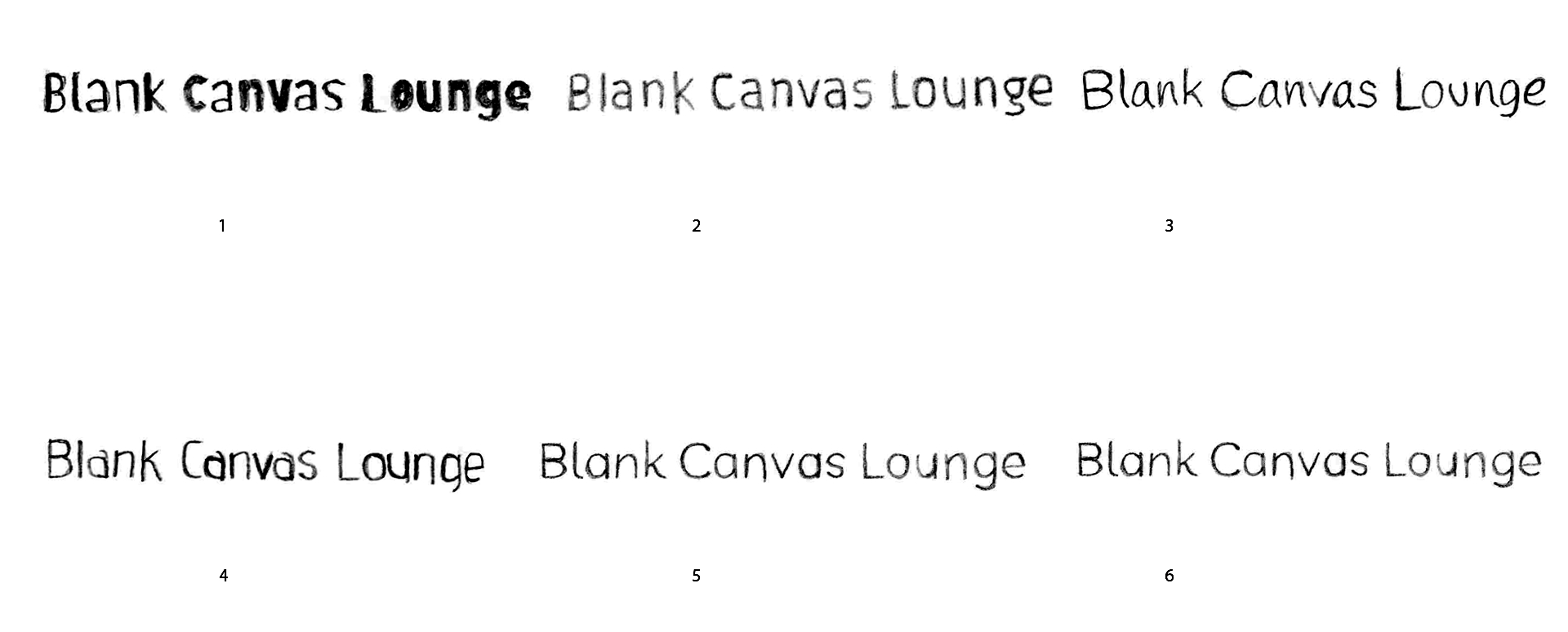
Font Sketch Research
I started looking into some fonts for the logo. I found six fonts that I thought would look nice with the name. After a while of looking them over, I thought about mixing some of the fonts to see if I can find a more interesting combination.
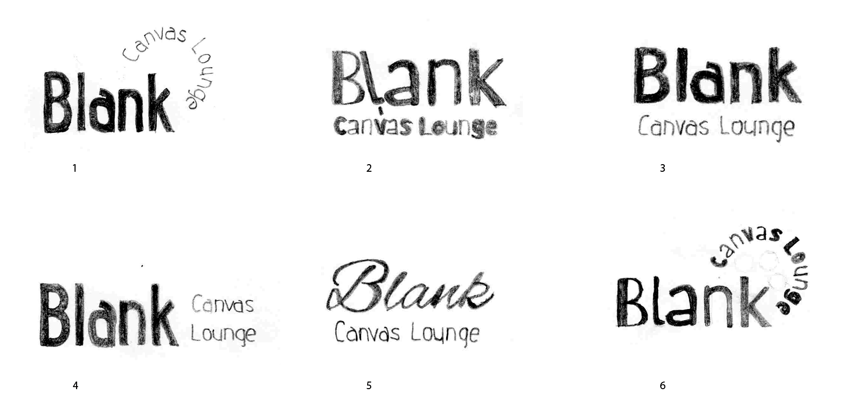
Logo Sketches
When I began to find different ways to format the logo, I also started to look into more cursive like fonts. I wanted to show the client a variety of options for the wordmark for their lounge.

Refined Designs
I refined what I thought was the best design to show the client. I didn't want to give the client too many options to overwhelm them, but I wanted to give them enough to see how subtle changes could make a difference. While also seeing what kind of direction they wanted to go.
Final Two
After they told me their favorites, I began to throw in some color. They wanted to incorporate color since that was a huge part of their business. I wanted to make sure to balance the vibe or their business with their niche in a creative way.
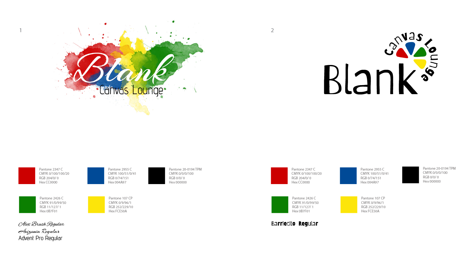
After hearing their thoughts on the two designs, they decided on the one on the left. I made a few changes as requested. I provided them with what the logo would look like in black and white. Then, I created a small branding guide for them and their business.
