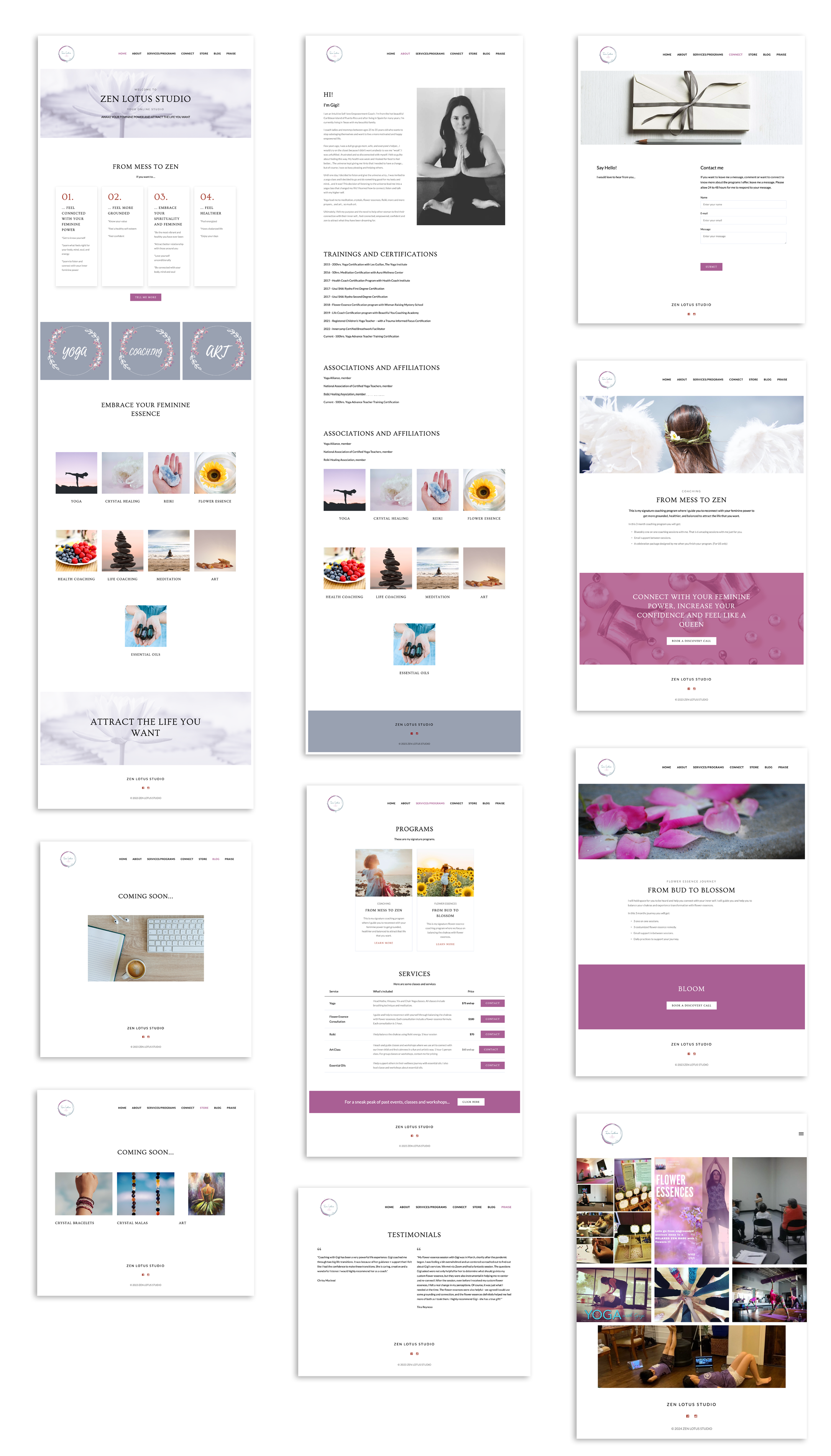
Zen Lotus Yoga Art offers a holistic wellness approach focused on empowering feminine energy. They provide services such as yoga, crystal healing, reiki, meditation, health and life coaching, and art. Their goal is to help individuals connect with their inner power, achieve balance, and foster a vibrant, healthy lifestyle. For more details, visit their website.
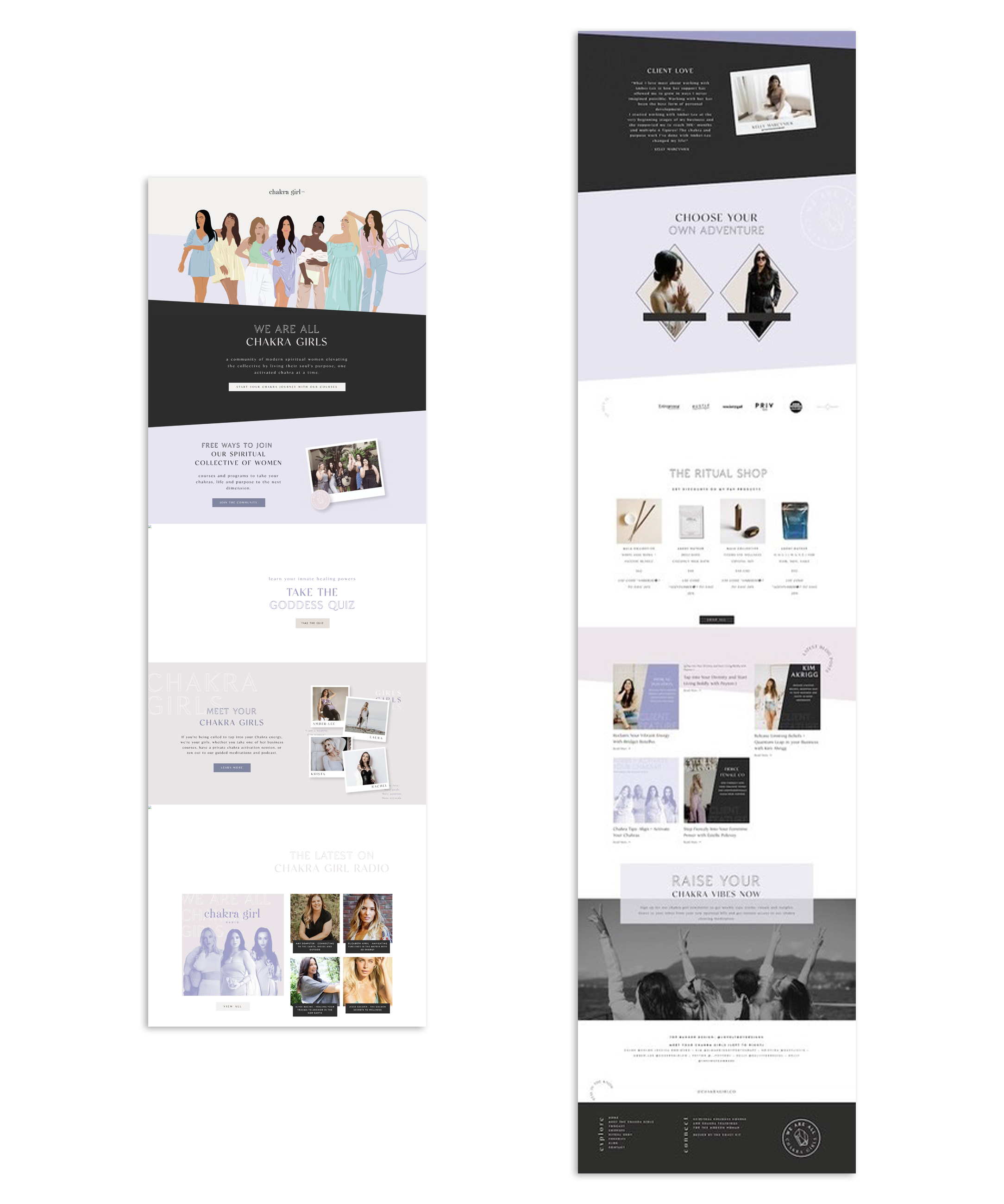
When discussing the website redesign with my client, she mentioned another website that she wanted to use as inspiration. She particularly liked the old design for www.chakragirlco.com and wanted something similar for her own site.
List of market featuers and elements that needs to improve.
The aim of Freedom Ride's new look is to hit all the key points listed above and continue to improve based on those key points. Responsive design was also created so the site could work on tablets and mobile.
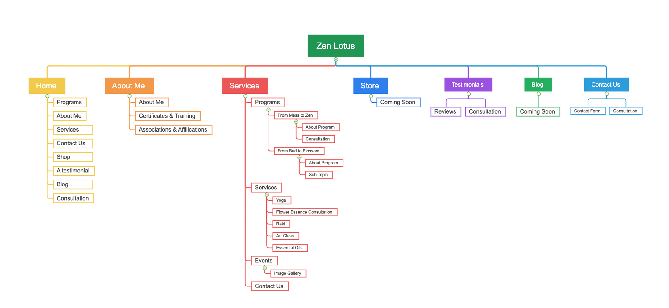
Site Map
Original Sitemap
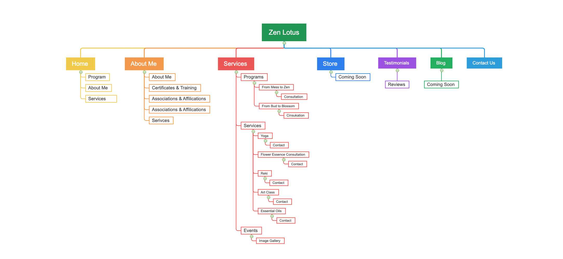
Proposed Sitemap
Key Touches
While learning more about my client's business and what she wanted to incorporate into her website, I thought it would be a wonderful idea to include her love for art on it. During the process, I reached out to her, asking if she could create a few symbols or icons to represent her services. She added a personal design touch to the website, enhancing its uniqueness.
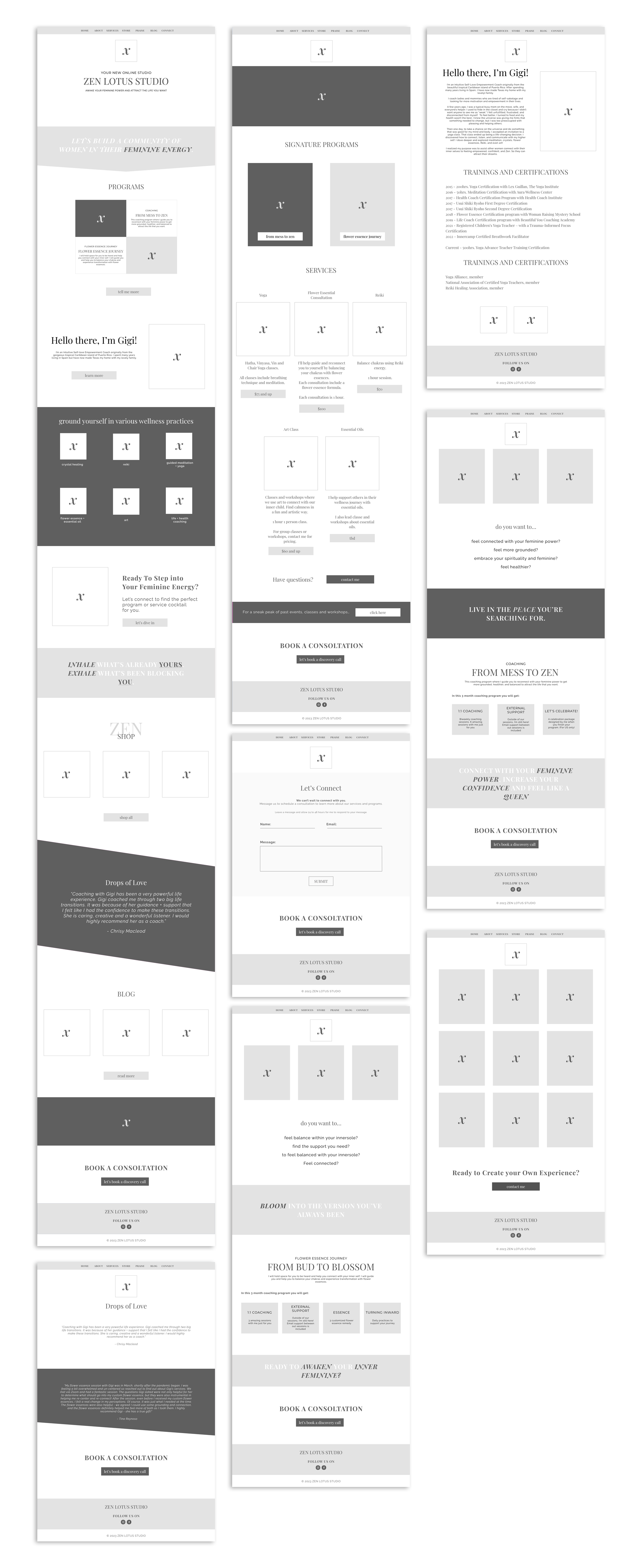
Wireframes
Branding Guide
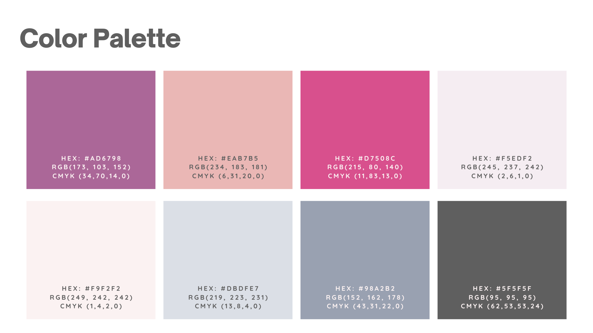
Freedom Ride needed a brand refresh in its color palette. I took their existing colors and decided to tone down the bright green and blues and found something more friendly and welcoming. While also adding some neutral colors in the secondary color palette to allow for contrast and hierarchy. It also allows giving the eye a rest from just seeing the primary colors.

By incorporating a modern, artistic design and refining the website’s structure, we organized the flow and structure of the website. Additionally, integrating the owner's unique artistic touch through her custom icons added a personalized and distinctive element to the site.
